May 05, 2010
Older: I Have No Talent (redux)
Newer: MongoSF MongoMapper Video
Improve Your Presentations In Under $50
Last fall, I taught a course on JavaScript at Notre Dame. Each class period was eighty minutes. There were two class periods per week and sixteen weeks in the semester. I approached each class period as I would a presentation, preparing slides, examples and what not.
Teaching this class and presenting at several conferences over the past few months has given me a lot of experience preparing and giving presentations. Seeing smarter and more skilled programmers struggle through a presentation because they lack experience has spurred me to collect some of the things I have learned that I feel would have helped them.
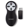
1. Kensington Wireless Presenter ($50)
 Formerly, whenever presenting, I would just stay near my computer and use the arrow keys. Sure, I stepped that up a bit and used an Apple remote at some point, but even then you have to have that darn remote pointed exactly at your computer for it to work.
Back in August, I did a presentation on MongoDB for Indy.rb and used Steve’s kensignton wireless presenter. To say it was life-changing, might be an understatement.
First, having something in your hand takes away the awkwardness that often ensues trying to figure out what to do with your hands during the presentation. Second, it always works. This enables you to move around and make your presentation more conversational. Plus, moving around wears off some of the extra energy that otherwise crackles through in your voice when pretending to be a statue behind the podium. I have also noticed that moving around also keeps the audience more engaged.
No more fumbling to go back or forward with your slides on your iphone, keyboard or Apple remote. Just talk and let this baby do the rest. I got mine for like $50 and I think they are even cheaper now.
2. Light Backgrounds, High Contrast ($0)
What!? Light backgrounds? But we are hackers and hackers have black terminals with green font colors! Yes, we do, but that does not mean that our slides should be black backgrounds with green fonts. Projectors always looked washed out. This means that you have to have really high contrast on anything you want the audience to see. I swear I am going to scream if I hear another presenter apologize for the fact that you cannot see their code.
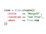 I stick to really light backgrounds and typically use white for all code slides. A white background in combination with TextMate’s Mac Classic theme and the Copy as RTF bundle means you can copy code from your editor and paste it into Keynote, syntax-highlighted and easy for the audience to see.
3. Font Size and Word Count ($0)
While were on the topic of being able to see things, bump up your font sizes. If you use a font size below 30px, you had better have a really good reason. I aim for 40px and only shrink down to 30px if I have to. Break up huge code blocks into multiple slides. You can even do a magic transition between them so it feels like the code is just gliding up and down the screen.
 On a similar note, your slides should not tell the whole story. I try to have around three to five words per slide. If you have more than that, the audience will just read your slides instead of listening to you. The less you have up on the screen, the more they pay attention to you, which is what you want. When I see a heading and four bullet points that are each a sentence long, my eyes glaze over and I check out.
4. Progress and Points ($0)
This point is actually a few points (poetically so). First, have three to five main points. As you go through your presentation, show the progress you are making towards those points. This does a couple things for the audience.
First, they get a feel for how far you are and what is left. When people know what to expect from the rest of your talk, it is easier for them to pay attention. On the other hand, if you drone on and on randomly, they will lose track of time and begin checking Twitter or doing anything else to occupy until you finish.
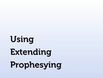 Second, repetition makes your presentation more sticky. For my MongoMapper presentation at MongoSF, I had three main points: Using, Extending and Prophesying. I showed all three points at the beginning and after I finished each section. I guarantee more people paid attention and remembered more when they left the room than if I would have just went through the slides without those three points, even if the rest of the content was the same.
5. Plenty of Fluids ($0)
Always have a water bottle. Every conference I have been at has free water. Grab one on the way to your presentation. There will inevitably be times when you need a drink if you talk for thirty minutes to an hour straight. No one in the audience will mind the wait and I always find it calming to stop for a bit here and there and refocus. Plus, plenty of fluids means the chances of an embarrassing voice squeak are lessened.
My Guarantee
I am not claiming to be a great presenter or that following these tips will make your presentation great. What I will guarantee is if you get an awesome wireless presenter, use light backgrounds with large, high-contrast fonts, minimize your slides, organize and repeat your main points and wet your whistle, you will do far better than if you don’t. Happy presenting!

10 Comments
May 05, 2010
I couldn’t agree more!
In fact, I said nearly the same thing a few years ago. Great minds?
May 05, 2010
@Geoffrey: Ha! I guess so. Thanks for linking that up. Pretty sure I saw that post, but I had forgotten about it.
May 05, 2010
I agree with all of these points, but I have one subtle adjustment that I’d like aspiring presenters to make: Bring your own bottle of water. We don’t really need more water bottles in land fills.
May 05, 2010
Nice article…both you and Steve looked like very polished presenters and the format and organization of your slides only helped make your points that much clearer. I really enjoyed both of your presentations at MongoSF. They were top-notch.
May 05, 2010
I’d suggest developing your talks with showoff. It helps me a lot because I don’t have to worry about themes, syntax highlighting, etc. I just have to worry about the content of my presentation. This ties into points #2 and #3.
May 05, 2010
@Jason McCay: Thanks! We appreciate comments like that.
@rick: If I didn’t have Steve I would do that, but he enjoys caring about that stuff (for me). :)
May 05, 2010
The remote is so essential, I don’t see why everyone doesn’t get one.
My critique is to use “off white” or light grey backgrounds. Many high-gain projection screens can become blinding with pure white.
I give a presentation about great presentations (despite that being quite a setup) which is available on github.
May 05, 2010
Good stuff! I remember Geoffrey’s post as well. You guys get it. That is why I mentioned that you should coach. Thanks for posting.
May 14, 2010
These are some great tips. Good know that I’m already down with these suggestions.
Dec 01, 2010
Good ideas, except the light backgrounds one.
High contrast = good, but for all the projected slides I’ve seen in the last 9 years bold white text on a black background is much much easier to read.
Sorry, comments are closed for this article to ease the burden of pruning spam.